Card
Cards are surfaces that display content and actions on a single topic. They should be easy to scan for relevant and actionable information. Elements, like text and images, should be placed on them in a way that clearly indicates hierarchy.
Cards are surfaces that display content and actions on a single topic. They should be easy to scan for relevant and actionable information. Elements, like text and images, should be placed on them in a way that clearly indicates hierarchy.
Simple Card is the one that contains a title, a descriptive text. To use the Simple Card Component, add card-title and card-text inside a div with class card.
Genius level intellect Proficient scientist and engineer Powered armor suit: Superhuman strength, speed, durability, agility, reflexes, and senses Supersonic flight Energy repulsor and missile projection Regenerative life support
Dismissable Card can be dismissed with a cross on the top corner.
Genius level intellect Proficient scientist and engineer Powered armor suit: Superhuman strength, speed, durability, agility, reflexes, and senses Supersonic flight Energy repulsor and missile projection Regenerative life support
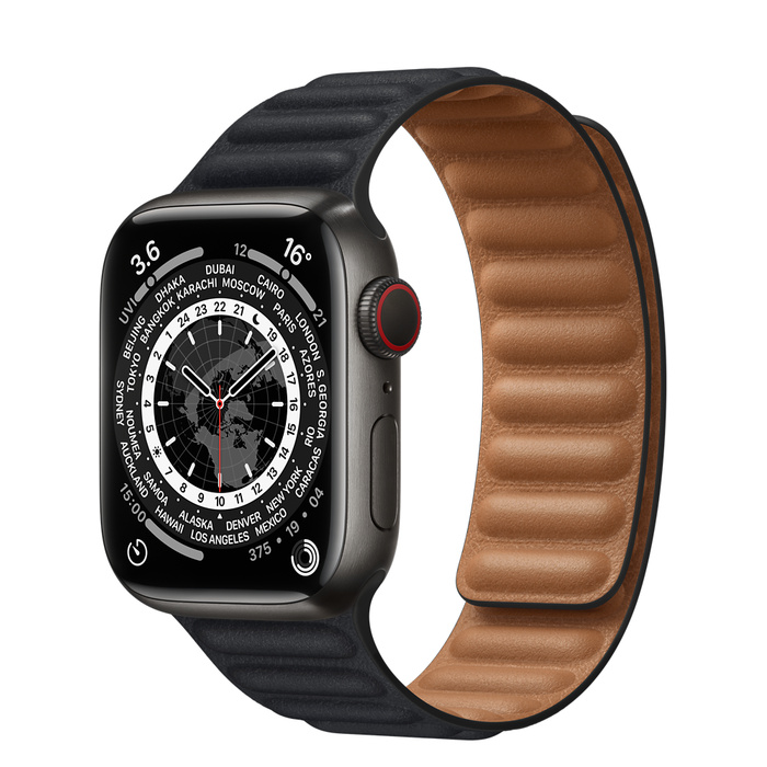
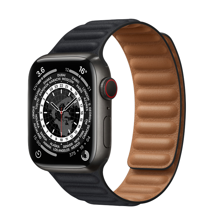
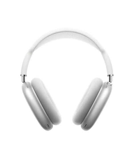
eCommerce Card is used to display the products details i.e., Product shot, Name, Type, Fixed badge, Price, Discount and stock.


Text Overlay Card contains text over image.

Horizontal Cards are used to showcase products in a landscape orientation.
